What are hotkeys?
Keyboard shortcuts, often called 'hotkeys', are keys or combinations of keys that perform an action in a digital product like a website or native application.
Depending on the platform, many keyboard shortcuts are available natively. For example, in OSX ⌘ + S is the hotkey for "Save".
Why would I include hotkeys in my digital product?
There are many reasons — but these are the three reasons why I personally invest the time to learn keyboard shortcuts, and why I think its worth it to take the time to provide them.
- Improve user speed and efficiency — by empowering the user to keep both their hands on the keyboard for longer, less time will be spent using a mouse or trackpad.
- Boost user productivity — if you've ever had to do data entry, or similar repetitive tasks, you can probably appreciate the producitivity boost provided by learning shortcuts.
- Increase user satisfaction — there's a deep sense of fulfillment in mastering a product. Learning the hotkeys is one of the quickest ways to that.
3 Things to Consider
1. System defaults
There are a number of universal hotkeys in any given operating system (OSX, Windows, Linux) and in 99% of cases it's best to avoid overriding them for two reasons:
- It can be frustrating for users who are expecting the system shortcut and instead getting your custom idea instead.
- It's expensive to override system defaults — you'll most likely have engineers doing a lot of extra work to cover multiple operating systems.
Conversely — you can use system defaults if you're providing a similar experience. For example — I find myself always hitting ⌘ + F in the Figma home screen hoping to activate the Search. To date, this does not work and my right hand has to make the grueling journey to the trackpad and click on the Search field, and then enter my query.
Bonus: Browser defaults
If the product you're working in isn't a native app, you have to be aware of browser defaults as well — again, it's possible to override them (as long as it makes sense) just note that there are costs to be weighed.
2. User Conventions
Research common conventions for your audience — depending on your project this can be fairly vague (e.g. people in a certain age group), to specific (e.g. designers who are used to apps like Figma, Sketch, etc).
For example, we recently implemented Algolia's DocSearch in our design system documentation. My first thought was to use the hotkey pattern that I'm always reaching for in VS Code — ⌘ Shift F.
After implementing, I heard from a couple people that it was kind of clunky — so I ran a poll and turns out — literally 80% of the team preferred an alternative, the / pattern popularized by Google in pretty much all their apps now — Gmail, YouTube, Drive, etc.
3. Platform Compatibility
Once you've decided what combination of keys to use — you have to consider how you'll account for them across operating systems.
Almost everyone knows the classic "undo" hotkey — ⌘ + Z (or ctrl + Z for Windows/Linux users). While the ⌘ key and ctrl key are often interchangeable between Mac/Windows, they aren't always. Apple keyboards also have a control (^) key.
For example, if you want your hotkey to use the ⌘ key in OSX and you don't specify one for Windows, the default corresponding key will be the Windows key — which is often not the most ergonomic choice so you'll most likely want to set it to the ctrl key.
Bonus: Localization!
Keyboard Layouts
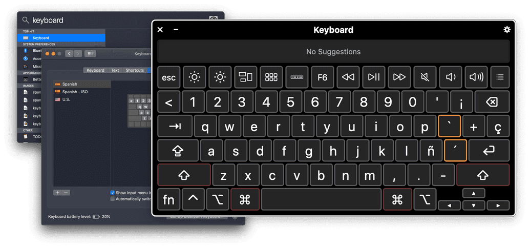
It's important to remember that keyboard layouts vary from country to country. And key codes don't always line up. In my earlier example / in American/English keyboards the key is directly left of the shift key — but in Spanish keyboards, the / is typed by combining the shift and 7 keys.
This presents a couple issues — ergonomically, it could be more difficult (or at least unexpected) for someone using a Spanish keyboard to use shift + 7 than it would be for an American audience. In this specific case — I went to GitHub Docs to see how they handled it. They maintained the / across languages, so either they didn't consider it or they tested it and it's fine for their audience — which is good enough for me.
Technically, it's an additional expense. You'll need to localize the hotkey either way — by setting the alternative (in my case, I set shift + 7 as another trigger), OR creating a custom hotkey per locale (I briefly entertained the idea of using - for Spanish but that introduced another layer of technical complexity that I wasn't willing to embrace for this example).
Languages
In addition to keyboard layouts, if your shortcut is based on the first letter of a word, an alternative could be considered. For example ⌘ + F opens up the "Find" dialog in most apps, however in the Spanish edition of Word, the hotkey is ⌘ + B (buscar).
This level of localization isn't common, however it's still something to think about if your basing your hotkey choice in a word (semantic) vs. a key position (ergonomic).
Summary
Designing keyboard shortcuts isn't too different from designing anything else — you need to have:
- A good goal — what are you trying accomplish?
- A solid understanding of your audience — who are you designing this for?
- Knowledge, or at least a desire to learn, about the medium — what are the limitations, capabilities?
- A budget — how much time or money can you spend to get things done?
And — of course it never hurts to get feedback from your audience along the way.
😊

