Special thanks to Jamie Street, Jimmy Musto, Jens Johnsson, Sergi Viladesau, Princess Buttercup, and all the fine folks at Unsplash for the photos.
If you’re as lazy as I am, you’ll definitely want to read this to learn how to set yourself up for hyper-efficient changes and updates to your Figma components. With all the time you save, you can do what I do and browse Unsplash’s cat photos for hours on end.
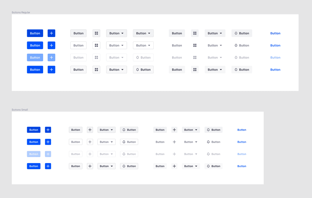
Look at all these buttons — if you’re new to Figma, or the atomic model, you might be thinking…okay 1 button x 4 states x 4 levels x 3 configurations…carry the 3…for those of you keeping score at home, that’s 48 components per size!
If you need to change the padding, and it takes you 15 seconds to do it per element…you need to budget 12 minutes for that. Okay thats not so bad…but how many of you only have buttons in your mockups (not looking at you, landing page marketers)?
48 mockups for a single component is not exactly what we in the industry would call ‘maintainable’. In the old days of Photoshop or Sketch, this is why mockups could take days or weeks to do!
Hopefully you get the point — that’s a lot of time for something that’s probably not going to deliver a measurable return on investment. Plus, it’s a really, really, really mind-numbingly repetitive task.
Thankfully, the fine folks at Figma took Sketch’s ‘symbols’ to a whole new level.
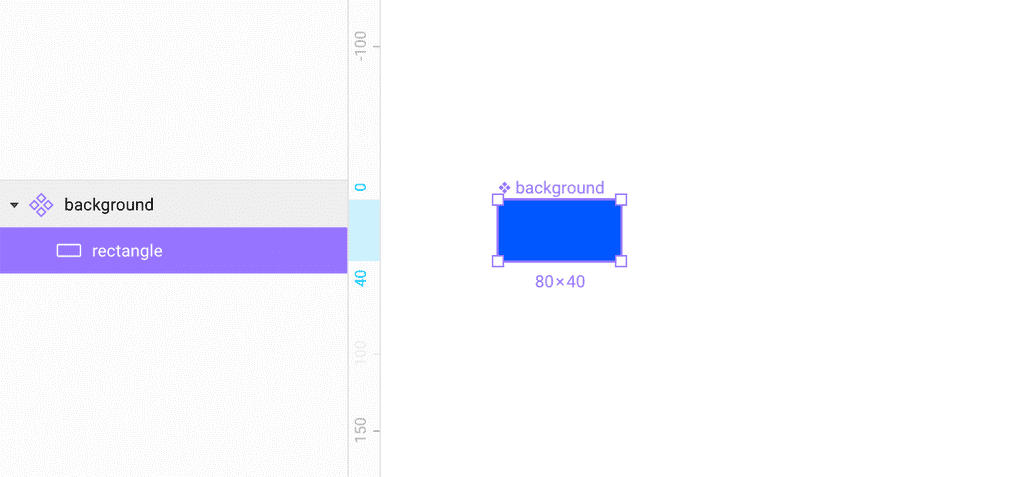
Introducing…the component!
 This is my component, there are many like it, but this is mine.
Something that differentiates this component from others, is that you can override properties on a child component, and then create a new master component, but the un-overridden properties will still be tied to the original master.
This is great and all, but what are some ways we can practically apply that in more complicated places than icons?
So glad you asked!
Step 1: Evaluate
Back to the buttons —
The first step is to take a long look at these things, and see they are more similar than different. I find it helpful to start listing the similarities:
- Font size
- Padding
- Border-radius
- Content positioning
and the differences:
- Color
- Text-color
- Border-color
So really, most of the differences are quite superficial. See, just like you and me, there’s more in common than different. What a heart-warming life lesson.
Step 2: Audit
Let’s get a little Platonic — what is the essence of a button? Well, in this case, there is a colored rectangle and some combination of text and an icon. Add a few more colors to the mix and you’ve got the magic that makes lead generation teams drool.
Let’s list out what exactly goes into a button:
- Background
- primary
- secondary
- tertiary
- none
- Content
- Text
- icon
- text + icon
- icon + text
- States
- default
- hover
- active
- disabled
These things will make up the quarks for our atoms.
Step 3: Construction
Previously, you might have started drawing boxes and adding text and icons straight away — this would be wrong. Instead, once you accomplish the first two steps we outlined, and we start to make components from each of these.
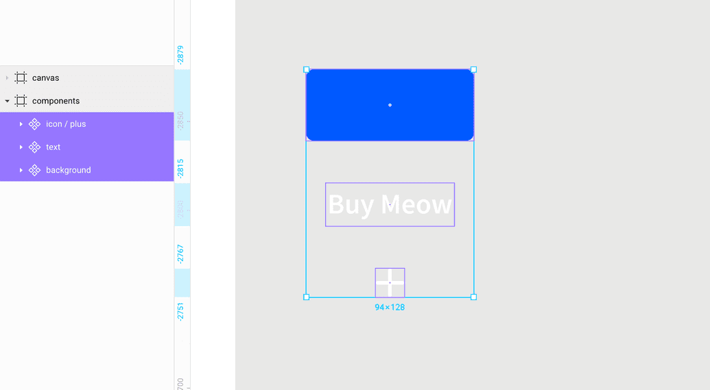
Your next components will be the content:
Take note of the icon component naming convention — this will come in handy later.
Next, duplicate and start combining these components to make slightly more complicated components.
 Emiliano pointed out that I should be using text styles for this, not changing the color of the text on the component level — touché Emiliano, I'll get you next time.
Now, you can start to see why nesting can be so powerful — I only need to change the color of the text in one place for that change to cascade to the other two components (sorry for the crappy video):
These are now the quarks that we’ll use to begin construction of the buttons:
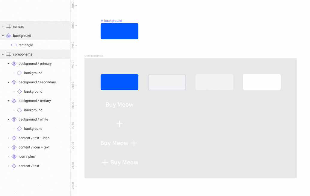 Disclaimer: Quarks is probably not the right term.
You will now start to see the true power of the nested component:
You can see that we can now adjust a number of properties in one place, and have those changes take effect across all of the children. Lets speed it up...and here we go, most of the main buttons are built out:
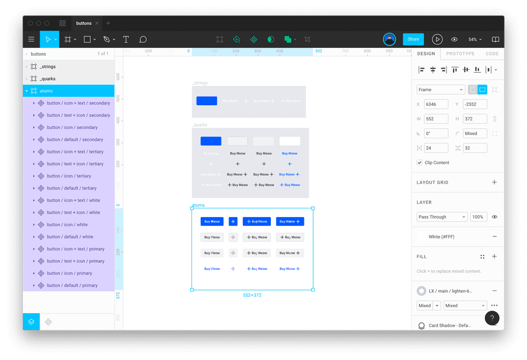 All the atomic button components.
Now that we’ve built all of the buttons using the quarks, you can witness the full power of this battlestation:
So — what have we learned?
- Evaluate what you’ve built, listing all of the pieces and properties
- Audit what you need, and how you want everything to work together
- Construct things smartly, re-using as few elements as possible
Take a look at the file and leave a comment in Figma if you have any ideas for making it even less work to change some of these things. I know I already have a few ideas!
If this is all a bunch of crap and you hate it, please be sure to let me have it on twitter — but also check out our careers page and help me out!
